We thought that it was only right to have our first official post of the year be one of the most beloved…our annual kitchen trends post. I’m getting chills as I type these words! It’s a new year, a renewed sense that things can be better and hopefully more beautiful. And for some of you lucky readers, a bit of that beauty may be coming from a kitchen remodel or even a light refresh. That’s where this post can actually be helpful. Though, if you are simply looking for general design news, that’s just as valid:) Everyone is welcome. I also feel inclined to say that while this is labeled as a “trend post,” we focus on design ideas that we love and don’t think will be “out” in a few years. Plus, regardless of how “2026” something may be, if it’s done well, it will look awesome forever. So without further ado, welcome to EHD’s 2026 Kitchen Trends Picks…
Stainless Steel Kitchens (And Accents)
 design by la.m studio | photo by alexis armane
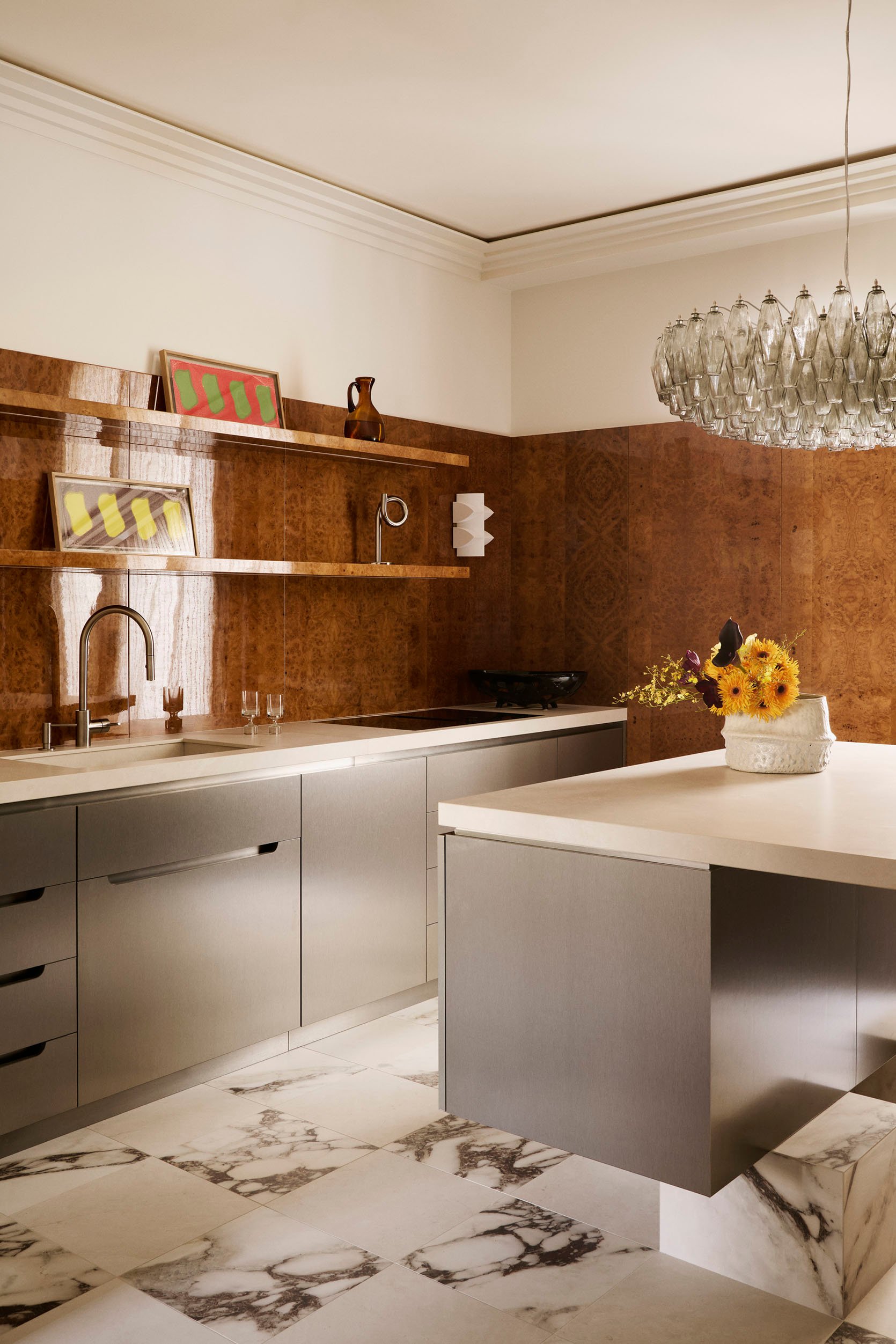
We have talked about this one in the past, but now more than ever, I am CONVINCED we will see stainless steel kitchens everywhere this year and beyond. And as you can see above and below, these kitchens are not cold, sterile designs. They are chic, fresh, and mixed with beautiful materials. I mean, burlwood walls, matte stainless steel cabinets, and marble tiled checkered floors??! Not to mention that incredible chandelier, which may be a new goal for my kitchen. LA.M Studio created such a stunning space.
 design by keep studio | photo by alexander william
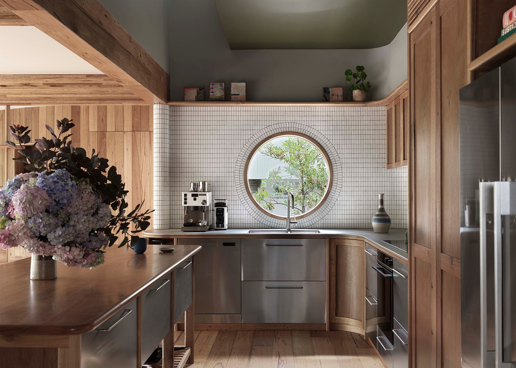
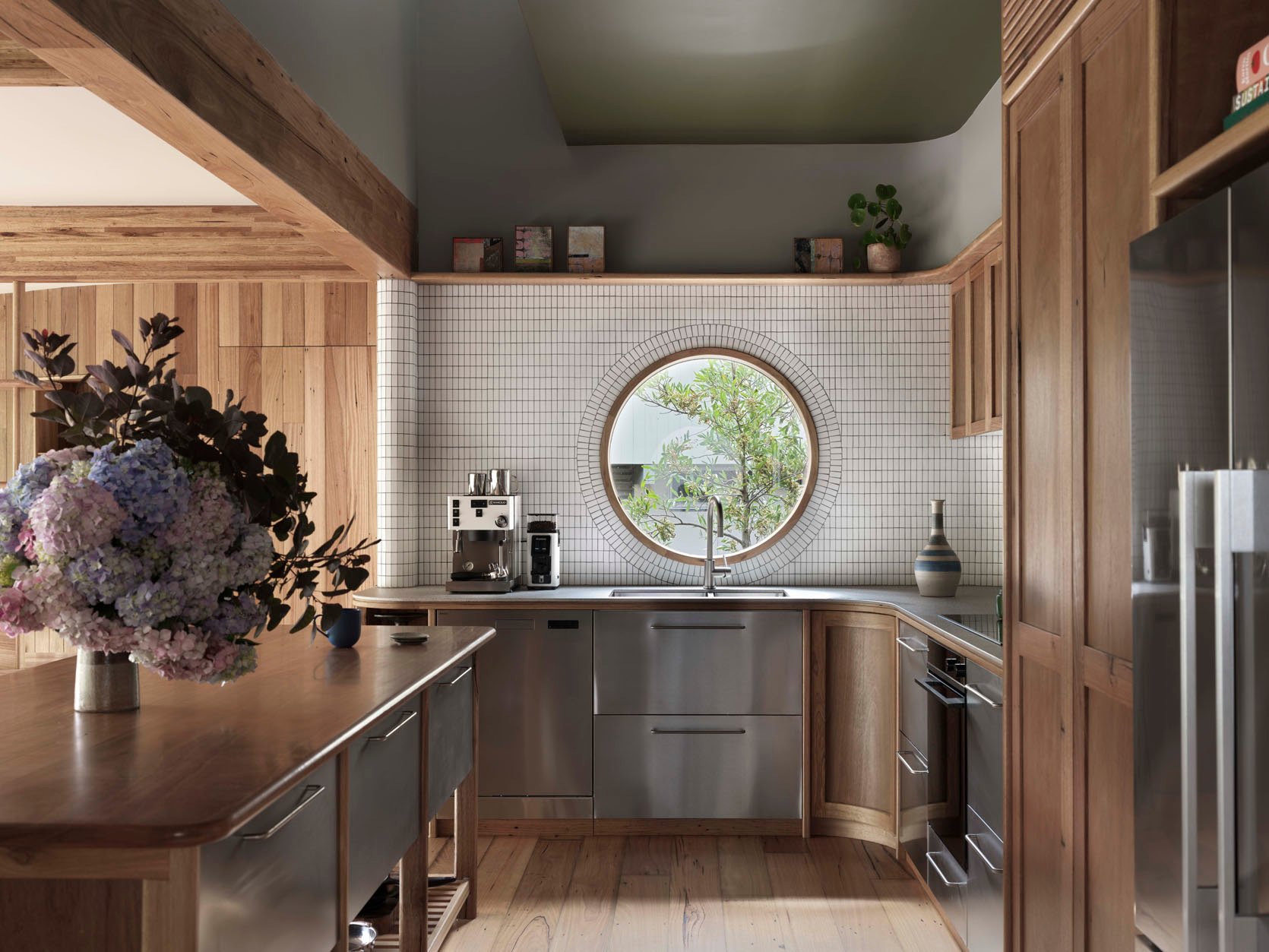
This unreal kitchen by Keep Studio completely flips the “hide your appliances” on its head and takes it a step further. All of the appliances are stainless steel, which then match all of the stainless steel drawers. The mix of cool-toned wood and steel feels both unique and effortless. It’s impossible for this design not to crack open your brain and think of the possibilities of incorporating stainless steel in really unexpected ways.
 design by keep studio | photo by alexander william
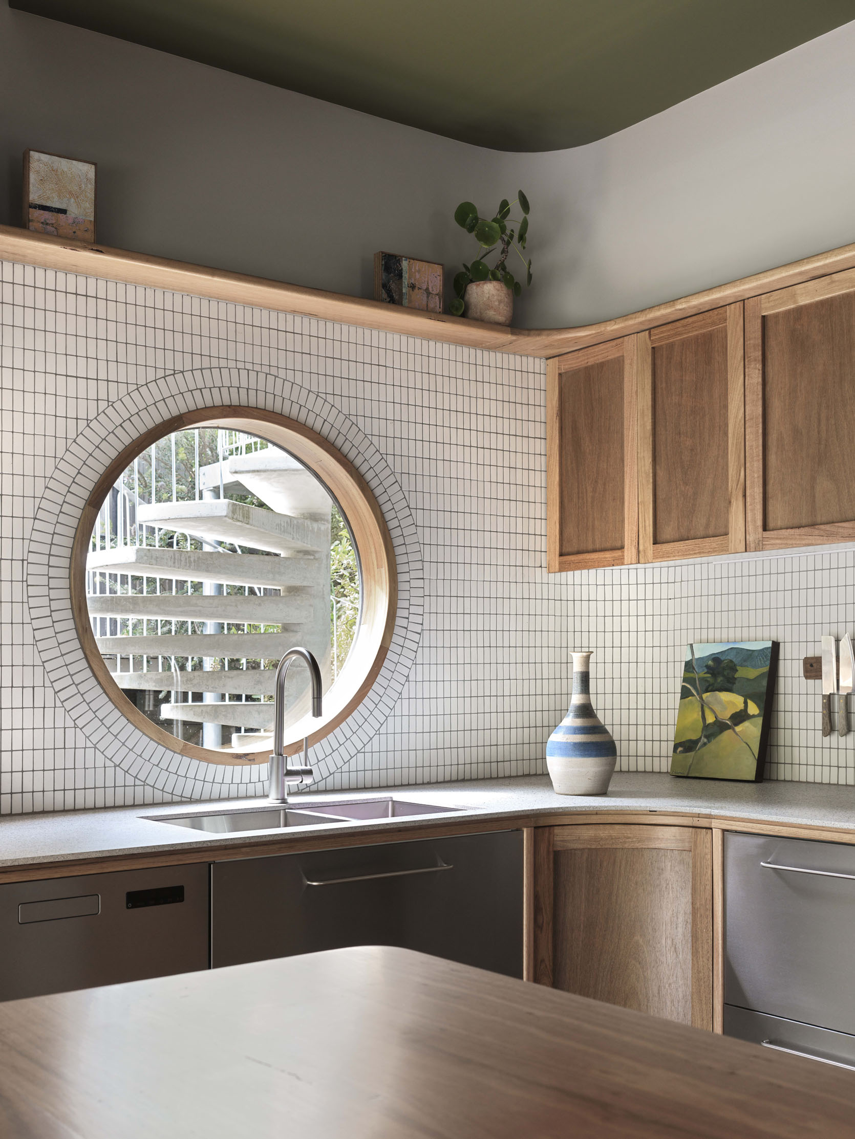
Here’s another angle and a closer look at that incredible window. Wow, wow, wow. I also adore the curve of the corner cabinet and how it talks to the curve of the wall and high shelf.
 design by sophie rowell | photo by chris snook
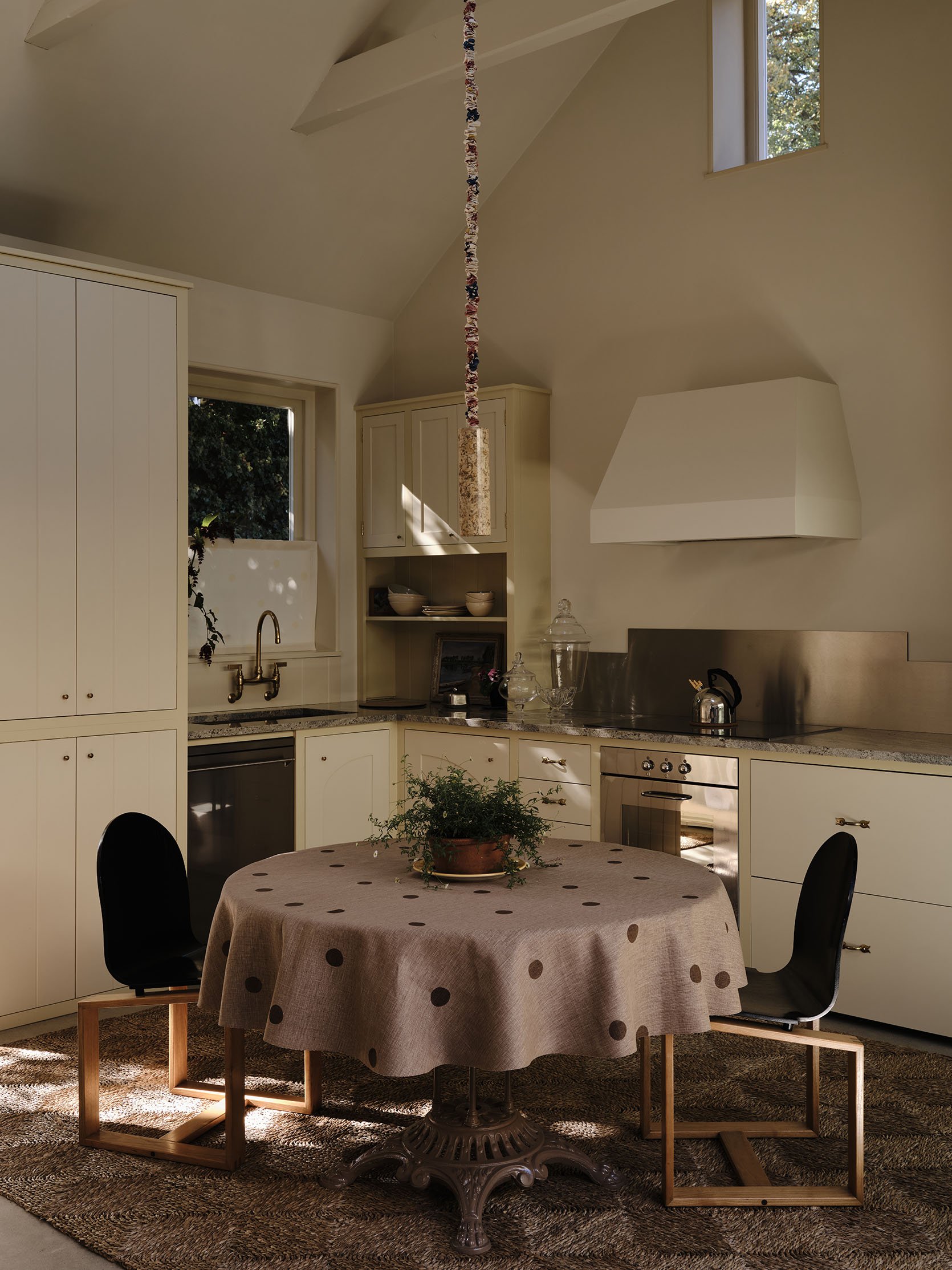
Now, the great Sophie Rowell whose designs are cozy, unexpected, a little traditional yet playful, designed this wonderful kitchen above. She didn’t lean hard into the stainless steel vibe but did add that awesome modern backsplash. It adds a juicy amount of contrast to the overall style of the space, but also balances with the appliances. Maybe an additional “kitchen trend” is that stainless steel appliances are back!
View this post on Instagram
A post shared by Beni (@beni_rugs)
This kitchen, which belonged to stylist Colin King, is now The Loft, Beni Rugs’ new space. The stainless steel really just comes in with the sink and appliances, but it shows how truly elevated and cozy it can look in a kitchen with the right materials designed with it. All that wood paneling is a beautiful contrast.
Tiled Cabana Stripes
 design by leah bradley | photo by laurel herzog | tile by concrete collaborative
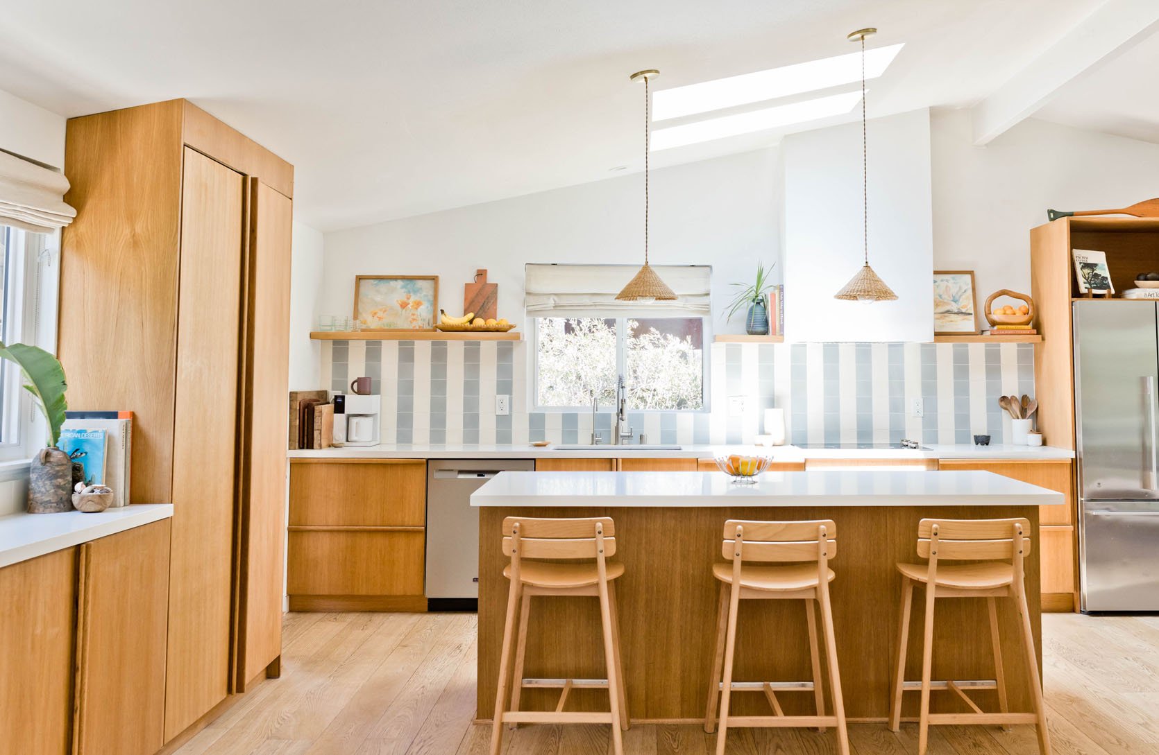
This one may feel a little risky for some, but in the right home with the right design, it’s everything! Case in point, Leah Bradley’s California coastal home. Without the stripe pattern, this is a beautiful, very neutral kitchen. But WITH the tile, a bold yet soft injection of energy is instantly felt.
 design by leah bradley | photo by laurel herzog | tile by concrete collaborative
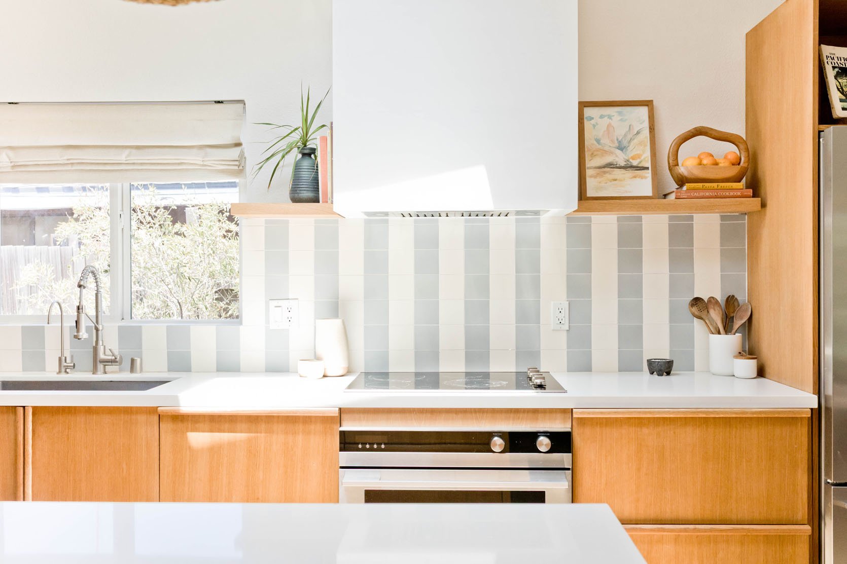
Color and tone are major factors in this design working. The soft colors not only flow with the tones of the rest of the kitchen but also with the vibe of the area. Coastal, beachy, and fun. This was a risk that couldn’t have paid off more.
 design by white studio & co interior design | photo by claire mcferran
I LOVE this kitchen. I also know I’m stretching it a little with the definition of cabana stripes, but it’s what I immediately thought when I saw this photo. I also love that you still get the impact of the look without needing to go for longer stripes.
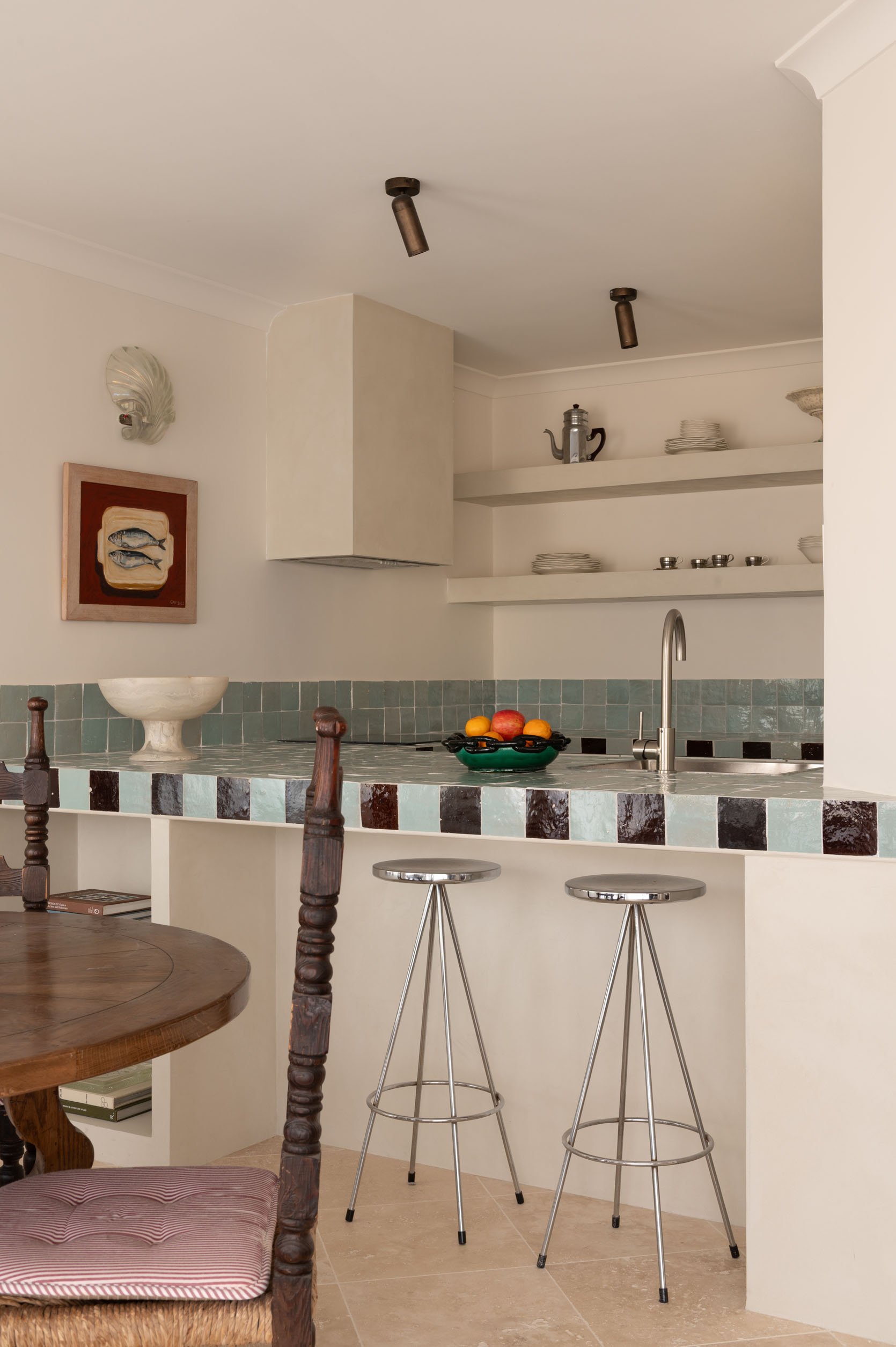 design by white studio & co interior design | photo by claire mcferran
So, as opposed to the lighter colors with long stripes of the first kitchen, here, White Studio & Co Interior Design used darker colors with a “short stripe” (or so that’s how it feels to me:)). Oh, and did you notice the stainless steel sink and chrome stools??
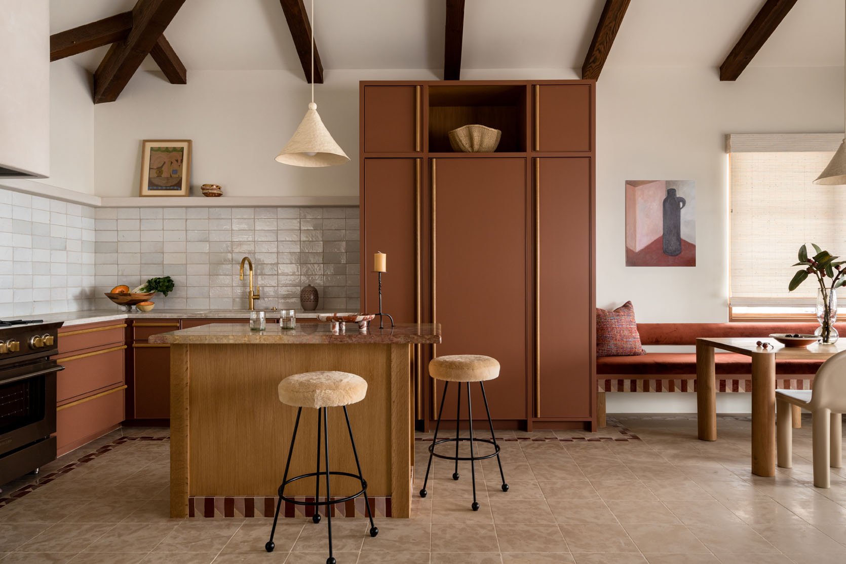 design by abbie naber | photo by charlotte lea
Another one for the short stripes! I love this small but massively impactful design choice Abbie Naber made in this kitchen. It just takes it to the next level visually. It’s also a great reminder that tile accents can be taken into dining spaces, especially in an open concept.
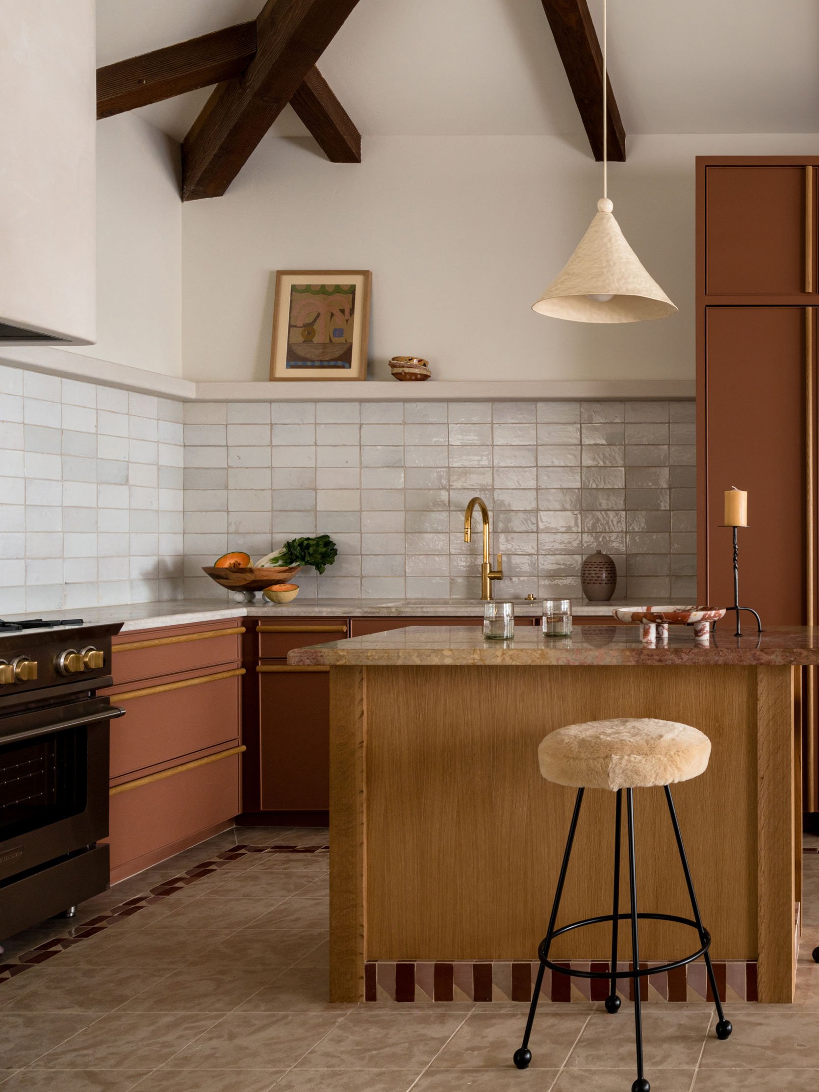 design by abbie naber | photo by charlotte lea
Here’s a closer look at the detailing on the island. It’s not a classic, two solid colored tile combo. See that little diagonal? Just so special.
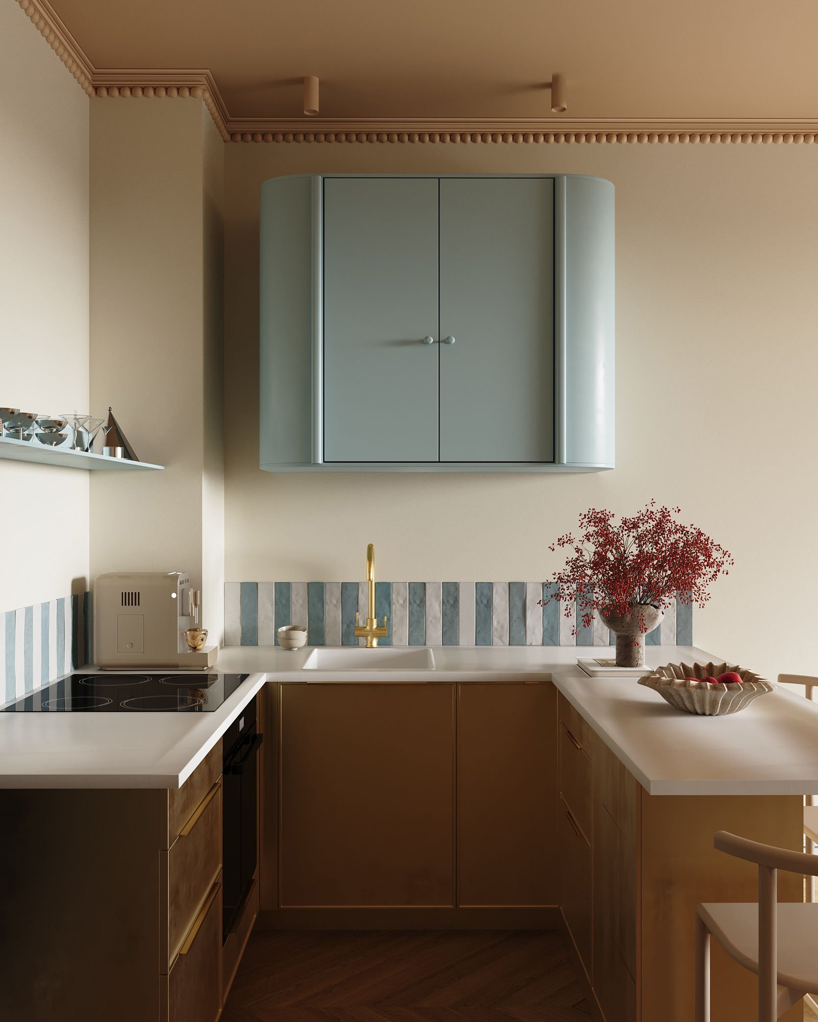
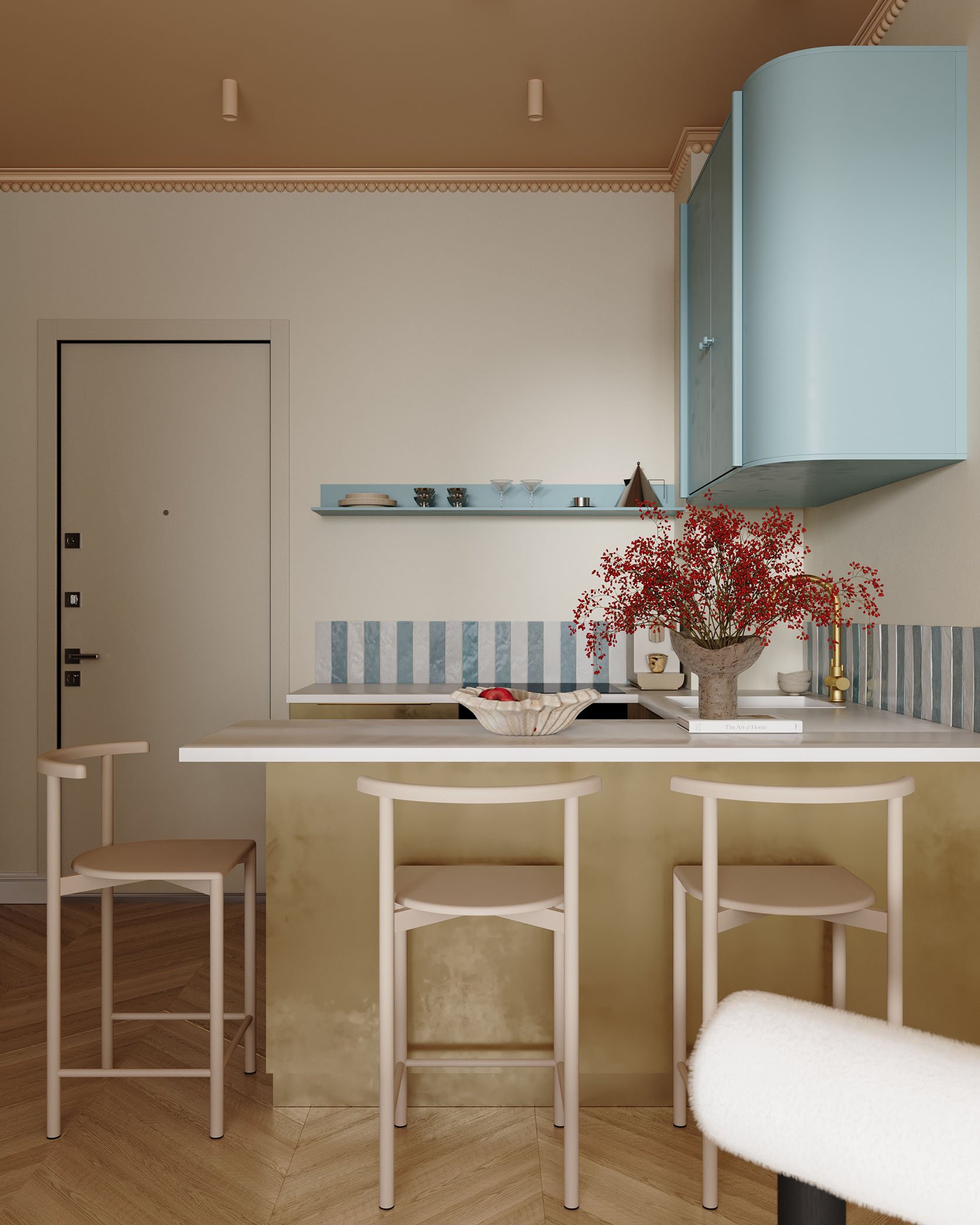
renders by daisy ausheva
Now, look at this kitchen render! That short backsplash is another great way to have that pop of pattern, even if you don’t want to go all the way up the wall. It’s so cool and fresh, and with that blue cabinet and shelf, I couldn’t love it more. Also, while this isn’t a completed, photographed space, I do think renders are a VERY good indicator of trends. It’s what designers are imagining in their ideal scenario:)
 design by vaughan design & development | photo by chris snook
I had to include this one because it was a different take and looks beautiful. Vaughan Design & Development designed a perfect kitchen and then made it even better with that horizontal stripe on the backsplash. What makes it great (and all of these stripes in this section) is that they are made with larger tiles and not those mini ones (you know which ones I mean). These are intentional and special, and I’m excited to see more of them this year!
Tonal Wood Hardware
 design by workstead | photo by matthew williams
Tonal wood hardware is making itself known, even if it matches perfectly with the wood cabinets:) Workstead can do no wrong in my book, and this kitchen is yet another example. There are a million details I love, but a big one is those round wood knobs. So simple but (say it with me), so special.
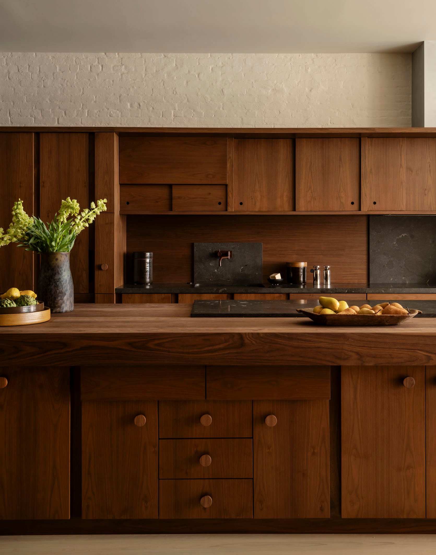 design by workstead | photo by matthew williams
See?! It doesn’t hurt that the wood is insanely gorgeous.
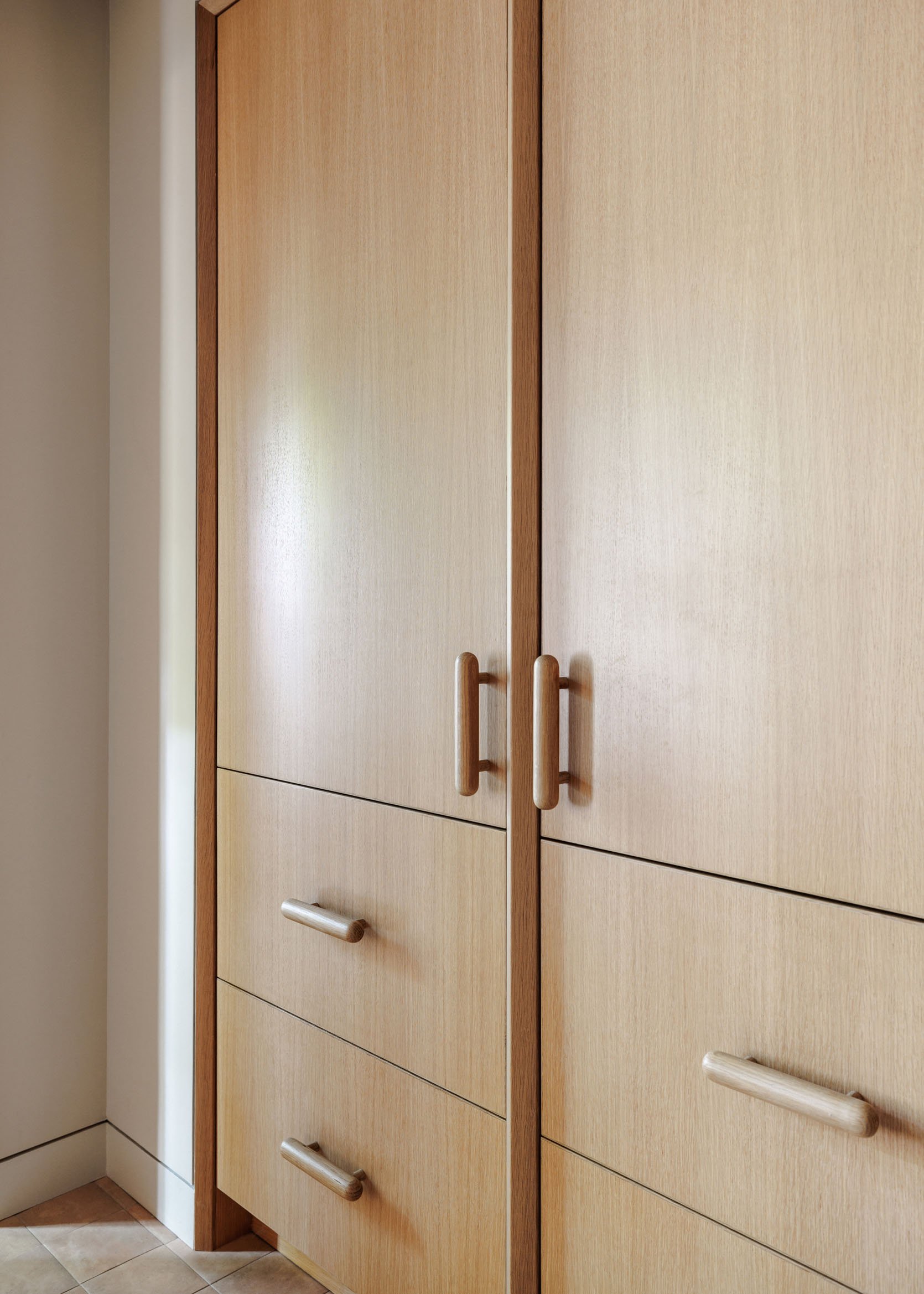
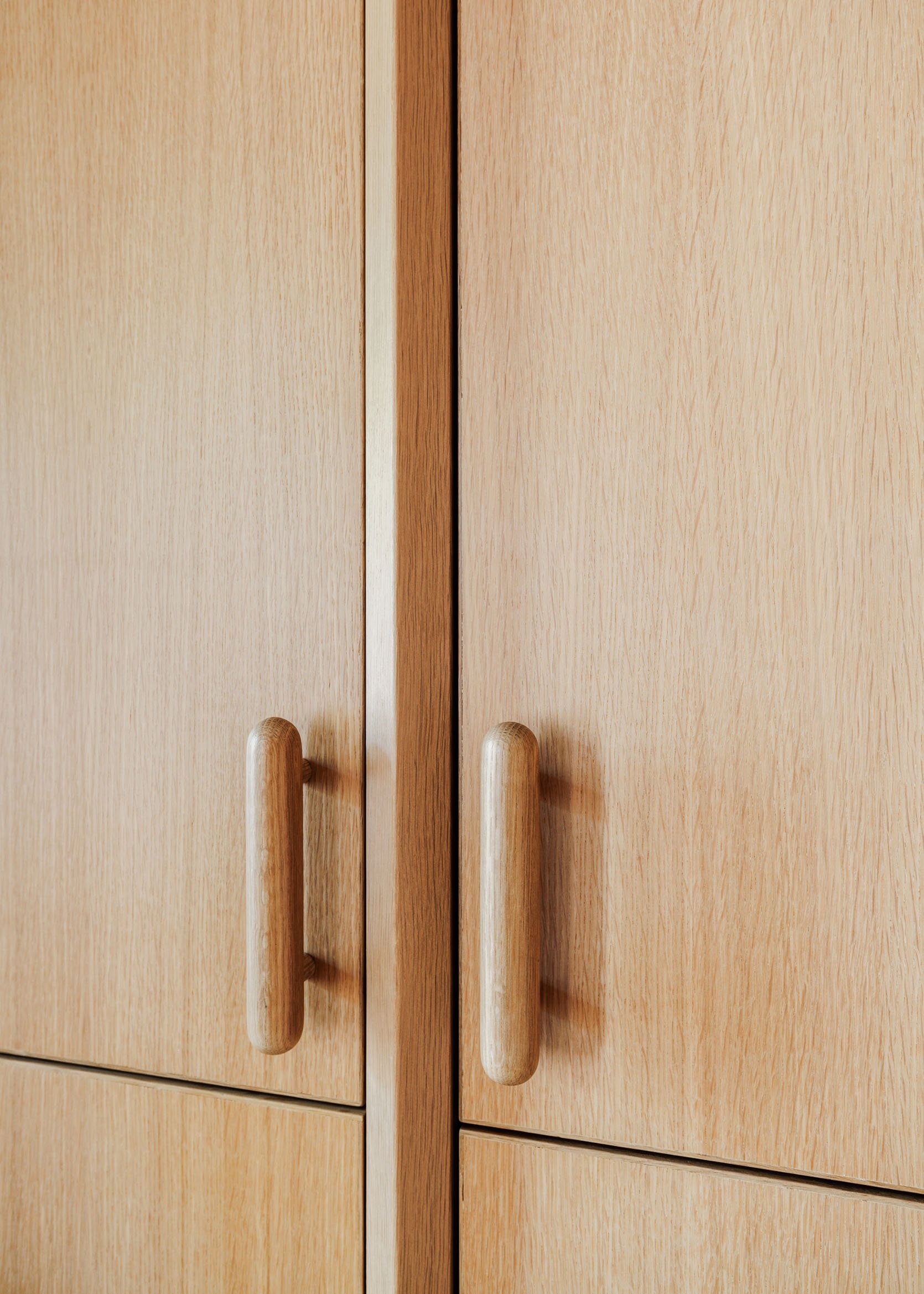
design by shapeless studio | photos by hagan hinshaw
I believe there has yet to be a January kitchen trends post (at least that I have done) that hasn’t included Shapeless Studio. Their work is, well, always inspiring, and these wooden custom-designed handles are just that. White oak, like the cabinets, and strong enough to be appliance pulls too!
 photo by drew michael scott
Want to know a really fun fact? Those wood cabinets you’re looking at are actually covered with contact paper! Drew is an unbelievably designer/DIYer, so no shock that it turned out beautiful. But what I also loved was that he used real wood DIY handles to really sell the whole “real” wood look.
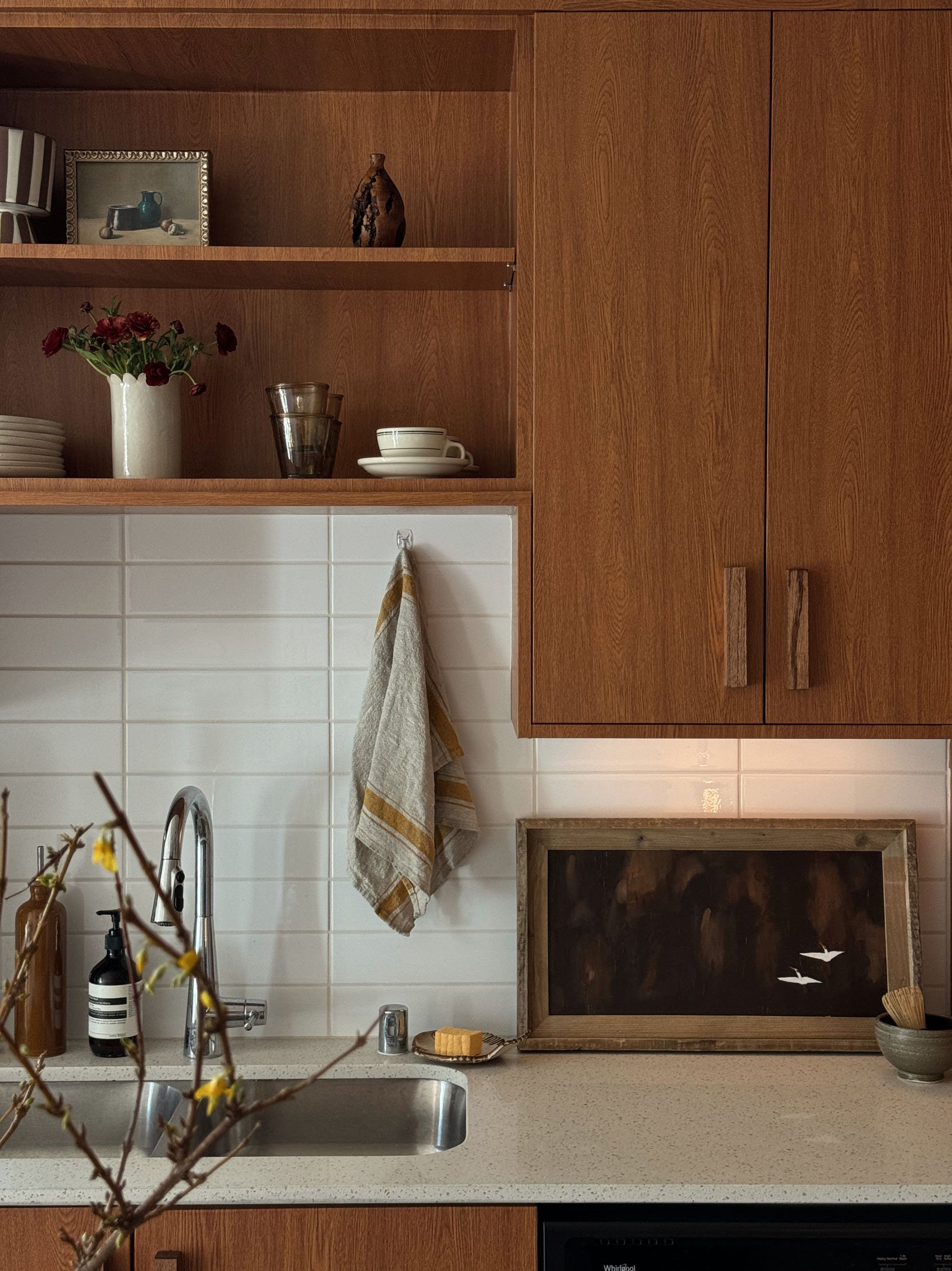 photo by drew michael scott
So this kitchen went from a bit cold and without a ton of personality to a beautiful, warm, renter-friendly dream. The wood on wood look really takes the space to a very elevated level:)
I also think this is a trend that’s extremely possible to easily incorporate into your existing wood cabinet kitchen. No reno necessary! Just find the right wood match hardware, and you are set.
Flat Panel Cabinet Fronts
 design by katy popple design | photo by erin kelly
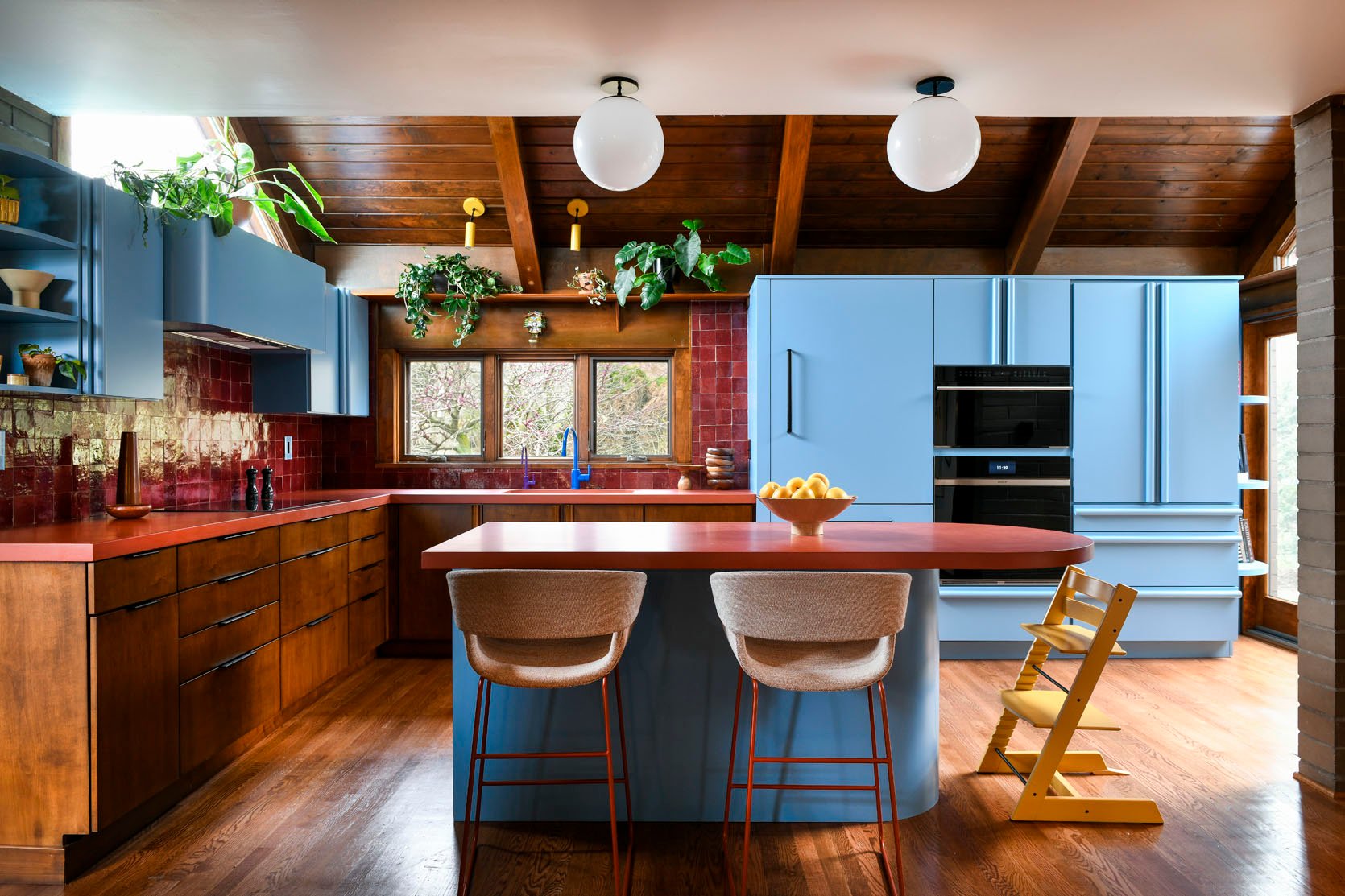
Shaker and micro Shaker cabinet fronts have been king for years now, but I think that flat panels are about to officially take over. That’s not to say we still don’t LOVE shakers and think they are beautiful (because they are). But baby, things are shifting. Let’s take this unreal kitchen by Katy Popple Design. Flat panel fronts with a mix of really awesome hardware. It’s clean, lets the materials and colors shine, and feels modern in the best way. Actually, if you look at all of the kitchens in this post, almost all of them have flat panel cabinet fronts. Jussssst saying.
 design by rebecca zajac | photo by sara ligorria-tramp
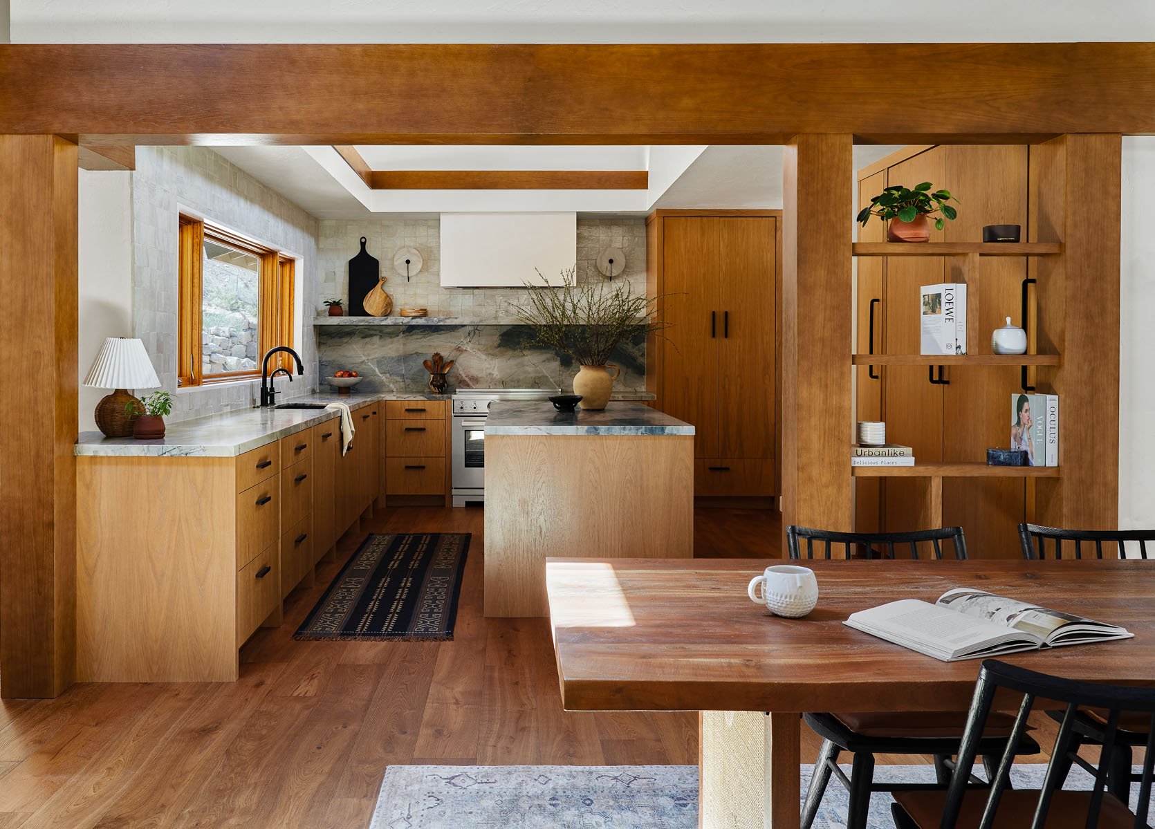
Here is another dream kitchen by Rebecca Zajac that’s more modern organic, and those flat fronts are perfect. It’s so clean to the eye and lets the materials really sing. I mean that stone is unreal!
View this post on Instagram
A post shared by Studio Monocco (@studiomonocco)
In case you wanted more proof of how beautiful they are…
View this post on Instagram
A post shared by The Brooklyn Studio (@the.brooklyn.studio)
…and another. But this example shows a more modern traditional look (love the two tones!). It’s also proof that Shaker isn’t the only “traditional” option.
 design by monika michalowska | photo by martyna rudnicka
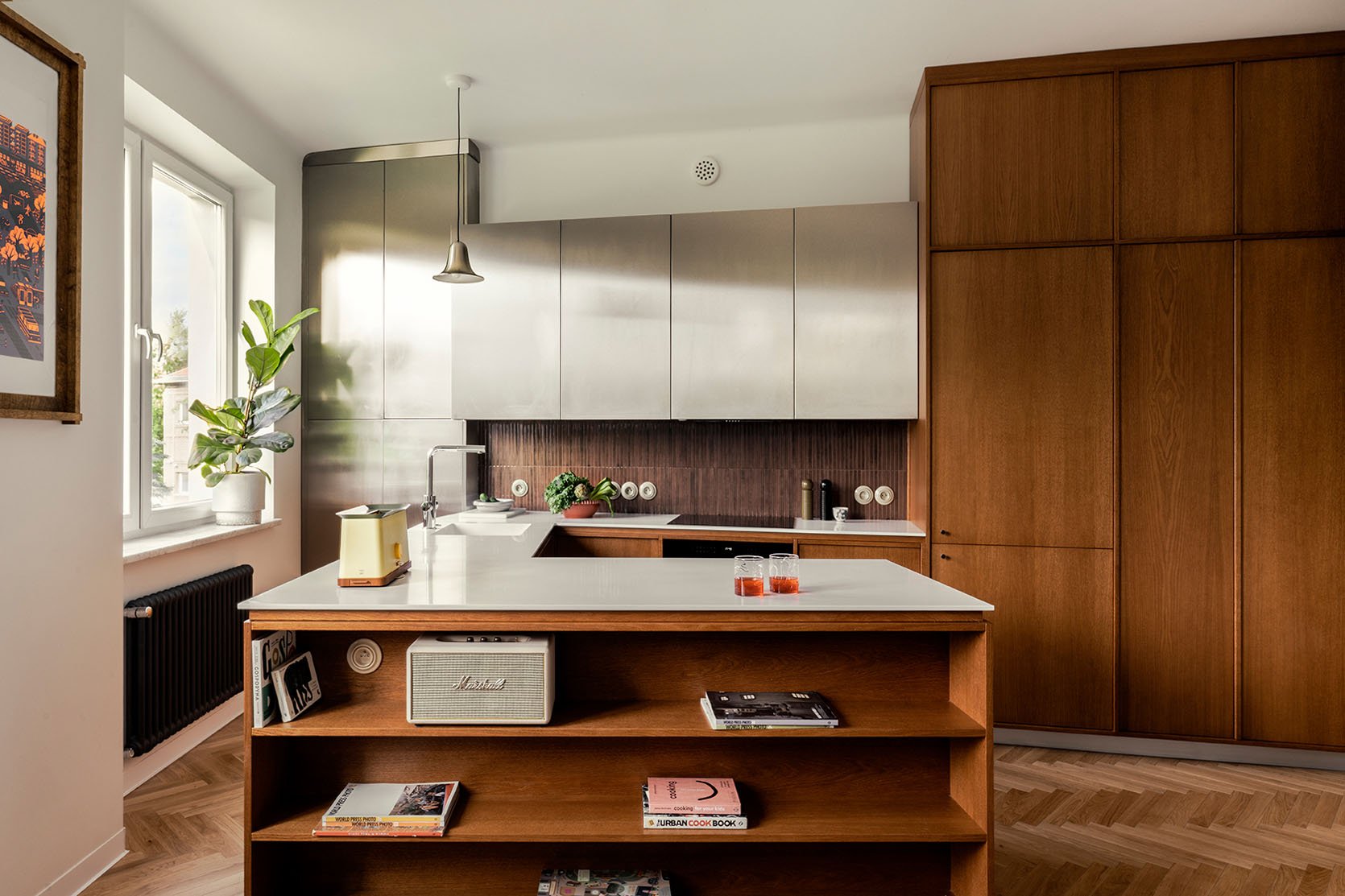
For my final example in this category, this one offers a slight twist. From what I’ve seen, most flat fronts are flush to the framing. The wood ones in this space are slightly set back, which I also love. A teeny detail that makes them a little different from the stainless steel ones. Intentional and interesting. No notes, this kitchen by Monika Michalowska is perfect.
Creamy Tiles
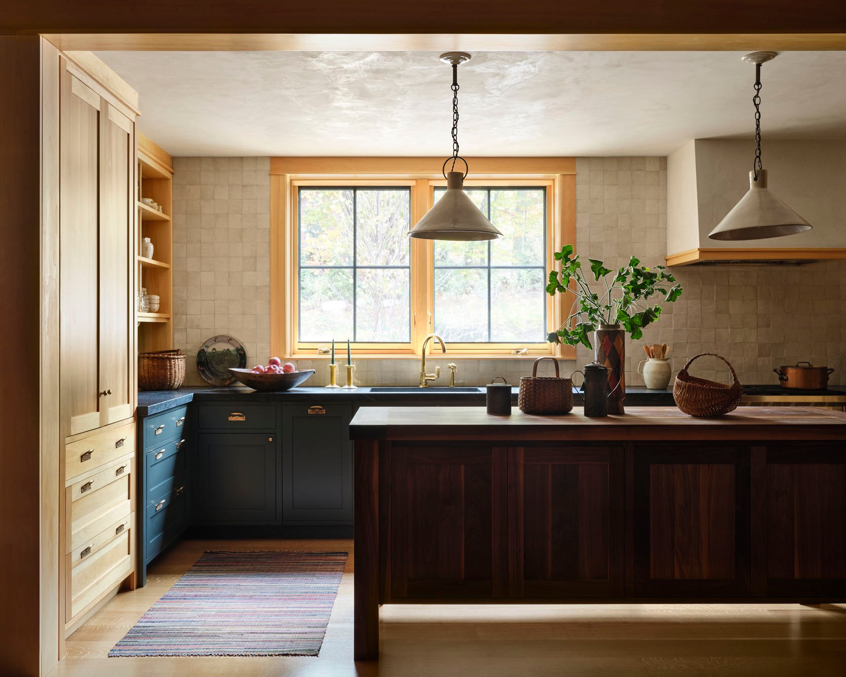 design by nina farmer interiors | styled by mieke ten have | photo by david mitchell
Another designer that I always look to for trends, Nina Farmer. Her style is so classic, but is always special and layered. So much soul in every space. But with this space, we are focusing our attention on those creamy wall tiles. We love an all-bright-white in the right space, but the softness of a cream or warm beige is like a hug for the eyes. This kitchen feels just like that – warm, beautiful, and just the right amount of color.
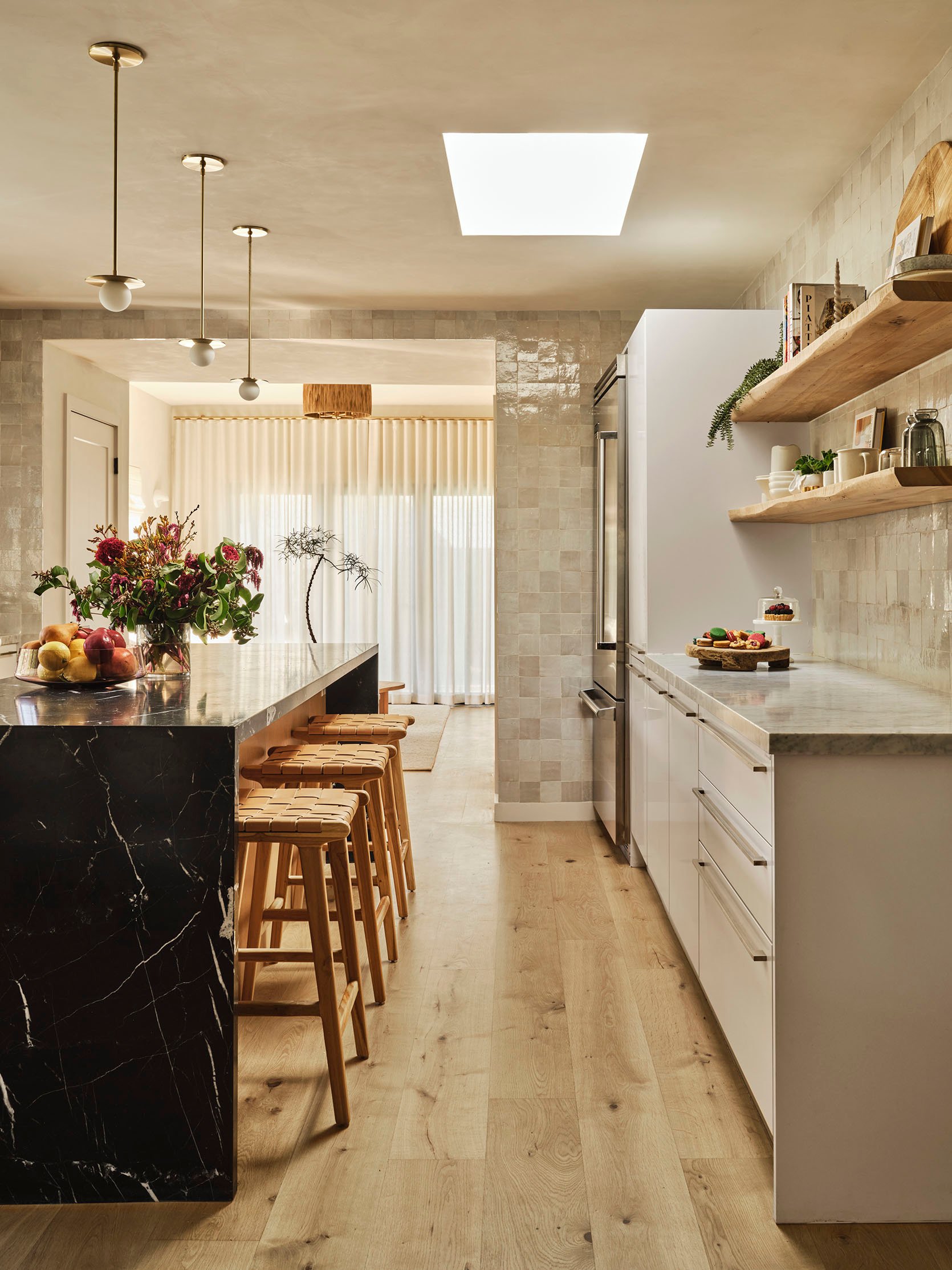 design by mandy cheng design | photo by madeline tolle
Now, the great Mandy Cheng used very similar, if not the same, Zellige tiles as Nina, and it’s just as warm but in a completely different way. The power of design!! Along with the live-edge wood shelves, the tiles soften the white cabinets, stainless steel accents (another example!), and the black stone island.
 design by mandy cheng design | photo by madeline tolle
It’s that seemingly small choice of choosing white versus cream/beige that can make the biggest impact.
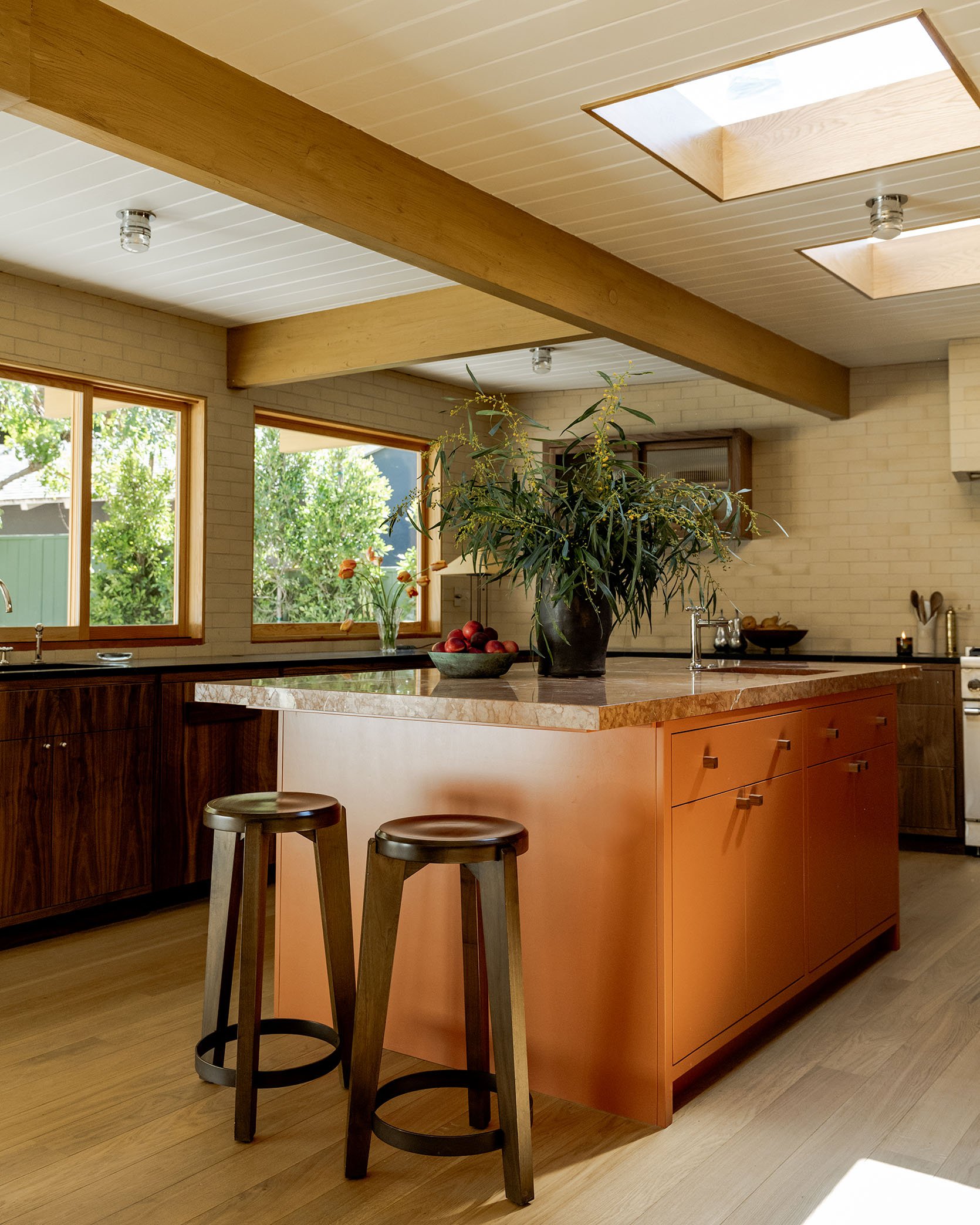
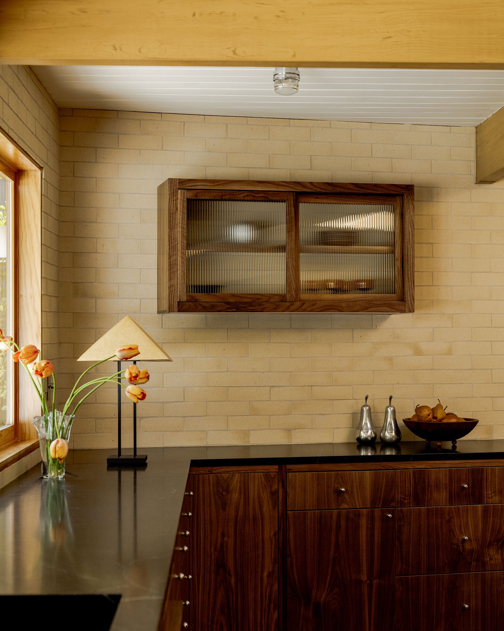
design by ome dezin | photos by ethan jones
While Zellige is still one of the major players in home tile, this cream-toned brick that Ome Dezin chose for this kitchen is so awesome. Almost a warm brutalism style that’s warmed up even more by that unreal dark cabinetry and modern island. Their work is always so exciting and beautiful.
Green Countertops
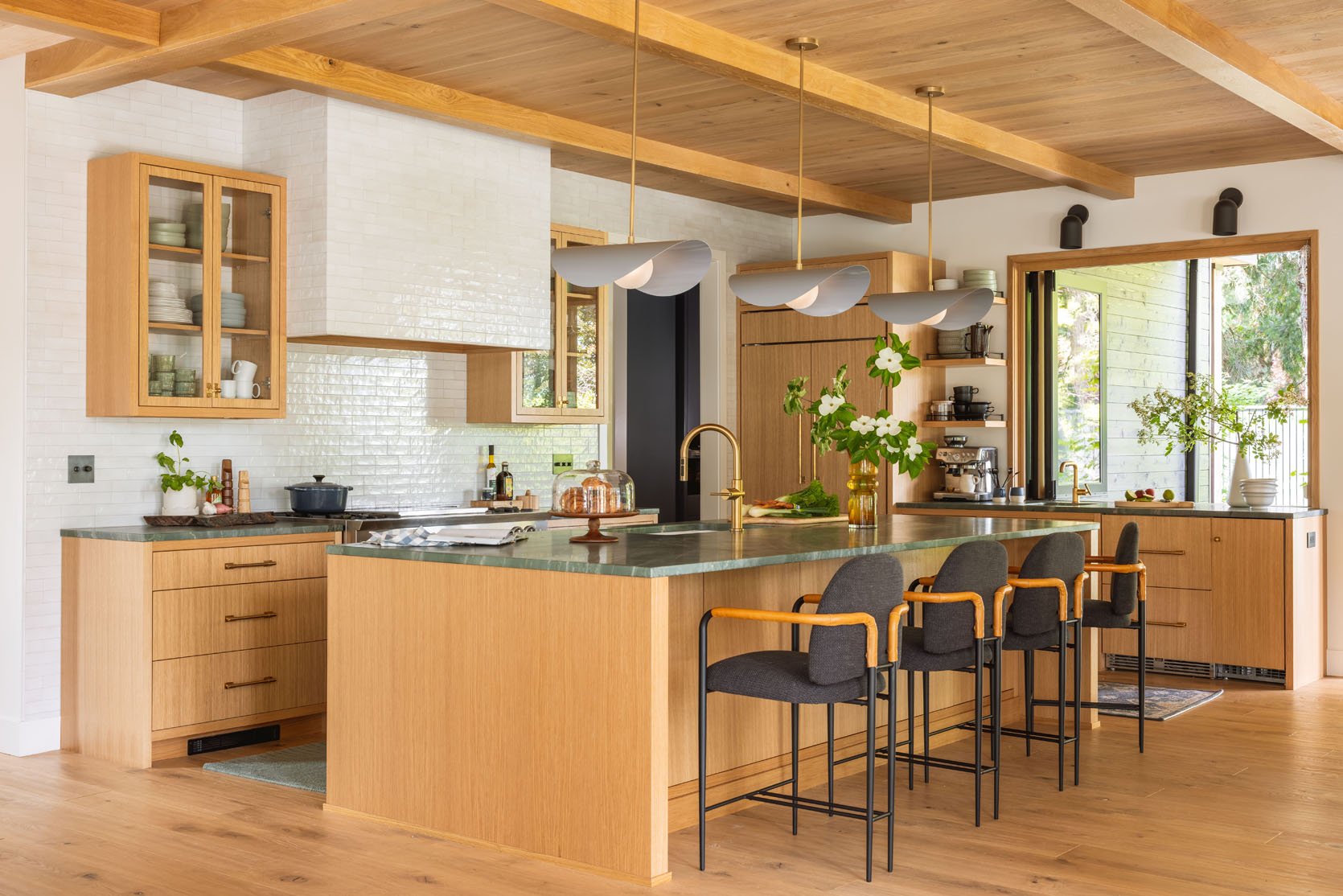 photo by kailtin green | from: river house kitchen reveal
It can feel a little strange using our own work in a trend post, but hey, green stone countertops are absolutely going to be a major player in 2026. I mean, it’s already happening! Choosing a colorful stone can feel like a huge risk because stone and fabrication aren’t cheap (or returnable). But green is a color that’s also more or less a neutral depending on the tone chosen. It goes with so much and is visually calming. Would this kitchen have been pretty with a white stone? Yes. Is it far more interesting and beautiful with the green? I think, YES.
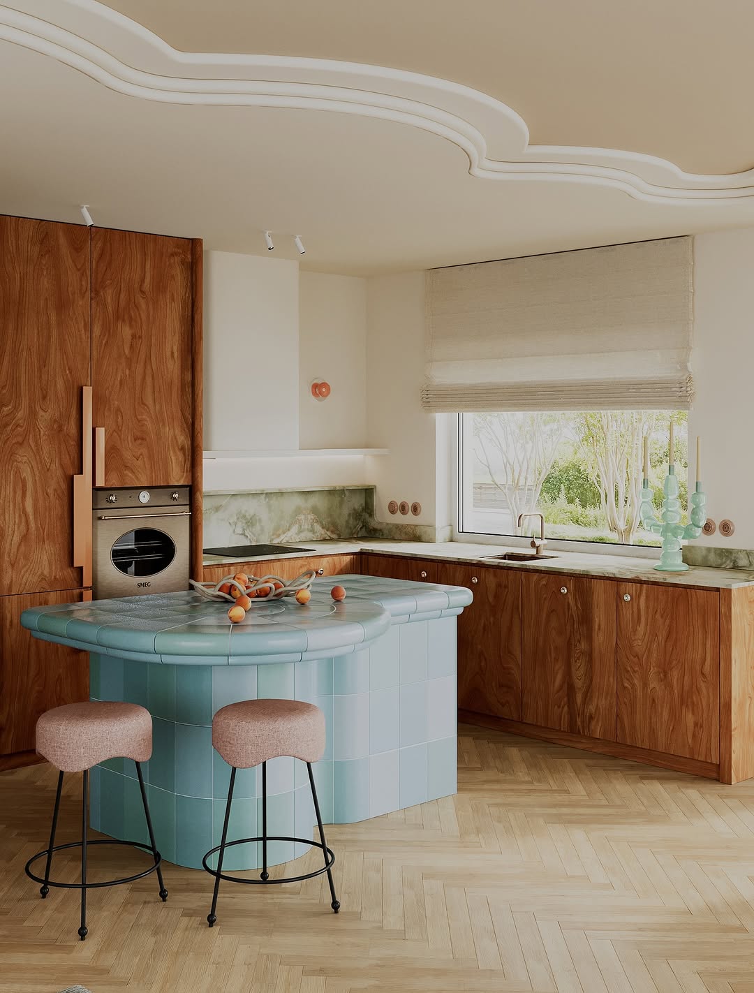 render by finch studio
Here is a render by Finch studio that I really love. It’s very modern, and at first glance, the blue tiled island is what you notice. But then your eyes move to the green countertop, and it’s a wow. So interesting but quiet, and that light green with the mid-toned warm wood is perfection.
View this post on Instagram
A post shared by Electric Bowery (@electricbowery)
But you can also go much darker, as a slight alternative to black, like Electric Bowery beautifully did.
View this post on Instagram
A post shared by Heidi Caillier Design (@heidicaillierdesign)
Or go for a tonal style like the great Heidi Caillier chose to do. I just love the green on green look.
There was a debate on whether Rosso Levanto marble(red marble) was on trend, and I couldn’t find it in enough kitchens. I absolutely think yes for smaller areas like bathrooms and pieces of furniture like accent tables, but for kitchens, I’m not totally convinced yet. I feel sure about green, but will happily be wrong for red:) I guess only time will tell. Oh, and we’re definitely keeping our eyes on butler pantries, too. We’ll check back in for our midyear kitchen trends report.
Thank you for reading, and hope it was fun! Any thoughts??
Love you, mean it.
Opening Image Credits: Design by Keep Studio | Photo by Alexander William

We thought that it was only right to have our first official post of the year be one of the most beloved…our annual kitchen trends post. I’m getting chills as I type these words! It’s a new year, a renewed sense that things can be better and hopefully more beautiful. And for some of you lucky readers, a bit of that beauty may be coming from a kitchen remodel or even a light refresh. That’s where this post can actually be helpful. Though, if you are simply looking for general design news, that’s just as valid:) Everyone is welcome. I also feel inclined to say that while this is labeled as a “trend post,” we focus on design ideas that we love and don’t think will be “out” in a few years. Plus, regardless of how “2026” something may be, if it’s done well, it will look awesome forever. So without further ado, welcome to EHD’s 2026 Kitchen Trends Picks…
Stainless Steel Kitchens (And Accents)
 design by la.m studio | photo by alexis armane
We have talked about this one in the past, but now more than ever, I am CONVINCED we will see stainless steel kitchens everywhere this year and beyond. And as you can see above and below, these kitchens are not cold, sterile designs. They are chic, fresh, and mixed with beautiful materials. I mean, burlwood walls, matte stainless steel cabinets, and marble tiled checkered floors??! Not to mention that incredible chandelier, which may be a new goal for my kitchen. LA.M Studio created such a stunning space.
 design by keep studio | photo by alexander william
This unreal kitchen by Keep Studio completely flips the “hide your appliances” on its head and takes it a step further. All of the appliances are stainless steel, which then match all of the stainless steel drawers. The mix of cool-toned wood and steel feels both unique and effortless. It’s impossible for this design not to crack open your brain and think of the possibilities of incorporating stainless steel in really unexpected ways.
 design by keep studio | photo by alexander william
Here’s another angle and a closer look at that incredible window. Wow, wow, wow. I also adore the curve of the corner cabinet and how it talks to the curve of the wall and high shelf.
 design by sophie rowell | photo by chris snook
Now, the great Sophie Rowell whose designs are cozy, unexpected, a little traditional yet playful, designed this wonderful kitchen above. She didn’t lean hard into the stainless steel vibe but did add that awesome modern backsplash. It adds a juicy amount of contrast to the overall style of the space, but also balances with the appliances. Maybe an additional “kitchen trend” is that stainless steel appliances are back!
View this post on Instagram
A post shared by Beni (@beni_rugs)
This kitchen, which belonged to stylist Colin King, is now The Loft, Beni Rugs’ new space. The stainless steel really just comes in with the sink and appliances, but it shows how truly elevated and cozy it can look in a kitchen with the right materials designed with it. All that wood paneling is a beautiful contrast.
Tiled Cabana Stripes
 design by leah bradley | photo by laurel herzog | tile by concrete collaborative
This one may feel a little risky for some, but in the right home with the right design, it’s everything! Case in point, Leah Bradley’s California coastal home. Without the stripe pattern, this is a beautiful, very neutral kitchen. But WITH the tile, a bold yet soft injection of energy is instantly felt.
 design by leah bradley | photo by laurel herzog | tile by concrete collaborative
Color and tone are major factors in this design working. The soft colors not only flow with the tones of the rest of the kitchen but also with the vibe of the area. Coastal, beachy, and fun. This was a risk that couldn’t have paid off more.
 design by white studio & co interior design | photo by claire mcferran
I LOVE this kitchen. I also know I’m stretching it a little with the definition of cabana stripes, but it’s what I immediately thought when I saw this photo. I also love that you still get the impact of the look without needing to go for longer stripes.
 design by white studio & co interior design | photo by claire mcferran
So, as opposed to the lighter colors with long stripes of the first kitchen, here, White Studio & Co Interior Design used darker colors with a “short stripe” (or so that’s how it feels to me:)). Oh, and did you notice the stainless steel sink and chrome stools??
 design by abbie naber | photo by charlotte lea
Another one for the short stripes! I love this small but massively impactful design choice Abbie Naber made in this kitchen. It just takes it to the next level visually. It’s also a great reminder that tile accents can be taken into dining spaces, especially in an open concept.
 design by abbie naber | photo by charlotte lea
Here’s a closer look at the detailing on the island. It’s not a classic, two solid colored tile combo. See that little diagonal? Just so special.


renders by daisy ausheva
Now, look at this kitchen render! That short backsplash is another great way to have that pop of pattern, even if you don’t want to go all the way up the wall. It’s so cool and fresh, and with that blue cabinet and shelf, I couldn’t love it more. Also, while this isn’t a completed, photographed space, I do think renders are a VERY good indicator of trends. It’s what designers are imagining in their ideal scenario:)
 design by vaughan design & development | photo by chris snook
I had to include this one because it was a different take and looks beautiful. Vaughan Design & Development designed a perfect kitchen and then made it even better with that horizontal stripe on the backsplash. What makes it great (and all of these stripes in this section) is that they are made with larger tiles and not those mini ones (you know which ones I mean). These are intentional and special, and I’m excited to see more of them this year!
Tonal Wood Hardware
 design by workstead | photo by matthew williams
Tonal wood hardware is making itself known, even if it matches perfectly with the wood cabinets:) Workstead can do no wrong in my book, and this kitchen is yet another example. There are a million details I love, but a big one is those round wood knobs. So simple but (say it with me), so special.
 design by workstead | photo by matthew williams
See?! It doesn’t hurt that the wood is insanely gorgeous.


design by shapeless studio | photos by hagan hinshaw
I believe there has yet to be a January kitchen trends post (at least that I have done) that hasn’t included Shapeless Studio. Their work is, well, always inspiring, and these wooden custom-designed handles are just that. White oak, like the cabinets, and strong enough to be appliance pulls too!
 photo by drew michael scott
Want to know a really fun fact? Those wood cabinets you’re looking at are actually covered with contact paper! Drew is an unbelievably designer/DIYer, so no shock that it turned out beautiful. But what I also loved was that he used real wood DIY handles to really sell the whole “real” wood look.
 photo by drew michael scott
So this kitchen went from a bit cold and without a ton of personality to a beautiful, warm, renter-friendly dream. The wood on wood look really takes the space to a very elevated level:)
I also think this is a trend that’s extremely possible to easily incorporate into your existing wood cabinet kitchen. No reno necessary! Just find the right wood match hardware, and you are set.
Flat Panel Cabinet Fronts
 design by katy popple design | photo by erin kelly
Shaker and micro Shaker cabinet fronts have been king for years now, but I think that flat panels are about to officially take over. That’s not to say we still don’t LOVE shakers and think they are beautiful (because they are). But baby, things are shifting. Let’s take this unreal kitchen by Katy Popple Design. Flat panel fronts with a mix of really awesome hardware. It’s clean, lets the materials and colors shine, and feels modern in the best way. Actually, if you look at all of the kitchens in this post, almost all of them have flat panel cabinet fronts. Jussssst saying.
 design by rebecca zajac | photo by sara ligorria-tramp
Here is another dream kitchen by Rebecca Zajac that’s more modern organic, and those flat fronts are perfect. It’s so clean to the eye and lets the materials really sing. I mean that stone is unreal!
View this post on Instagram
A post shared by Studio Monocco (@studiomonocco)
In case you wanted more proof of how beautiful they are…
View this post on Instagram
A post shared by The Brooklyn Studio (@the.brooklyn.studio)
…and another. But this example shows a more modern traditional look (love the two tones!). It’s also proof that Shaker isn’t the only “traditional” option.
 design by monika michalowska | photo by martyna rudnicka
For my final example in this category, this one offers a slight twist. From what I’ve seen, most flat fronts are flush to the framing. The wood ones in this space are slightly set back, which I also love. A teeny detail that makes them a little different from the stainless steel ones. Intentional and interesting. No notes, this kitchen by Monika Michalowska is perfect.
Creamy Tiles
 design by nina farmer interiors | styled by mieke ten have | photo by david mitchell
Another designer that I always look to for trends, Nina Farmer. Her style is so classic, but is always special and layered. So much soul in every space. But with this space, we are focusing our attention on those creamy wall tiles. We love an all-bright-white in the right space, but the softness of a cream or warm beige is like a hug for the eyes. This kitchen feels just like that – warm, beautiful, and just the right amount of color.
 design by mandy cheng design | photo by madeline tolle
Now, the great Mandy Cheng used very similar, if not the same, Zellige tiles as Nina, and it’s just as warm but in a completely different way. The power of design!! Along with the live-edge wood shelves, the tiles soften the white cabinets, stainless steel accents (another example!), and the black stone island.
 design by mandy cheng design | photo by madeline tolle
It’s that seemingly small choice of choosing white versus cream/beige that can make the biggest impact.


design by ome dezin | photos by ethan jones
While Zellige is still one of the major players in home tile, this cream-toned brick that Ome Dezin chose for this kitchen is so awesome. Almost a warm brutalism style that’s warmed up even more by that unreal dark cabinetry and modern island. Their work is always so exciting and beautiful.
Green Countertops
 photo by kailtin green | from: river house kitchen reveal
It can feel a little strange using our own work in a trend post, but hey, green stone countertops are absolutely going to be a major player in 2026. I mean, it’s already happening! Choosing a colorful stone can feel like a huge risk because stone and fabrication aren’t cheap (or returnable). But green is a color that’s also more or less a neutral depending on the tone chosen. It goes with so much and is visually calming. Would this kitchen have been pretty with a white stone? Yes. Is it far more interesting and beautiful with the green? I think, YES.
 render by finch studio
Here is a render by Finch studio that I really love. It’s very modern, and at first glance, the blue tiled island is what you notice. But then your eyes move to the green countertop, and it’s a wow. So interesting but quiet, and that light green with the mid-toned warm wood is perfection.
View this post on Instagram
A post shared by Electric Bowery (@electricbowery)
But you can also go much darker, as a slight alternative to black, like Electric Bowery beautifully did.
View this post on Instagram
A post shared by Heidi Caillier Design (@heidicaillierdesign)
Or go for a tonal style like the great Heidi Caillier chose to do. I just love the green on green look.
There was a debate on whether Rosso Levanto marble(red marble) was on trend, and I couldn’t find it in enough kitchens. I absolutely think yes for smaller areas like bathrooms and pieces of furniture like accent tables, but for kitchens, I’m not totally convinced yet. I feel sure about green, but will happily be wrong for red:) I guess only time will tell. Oh, and we’re definitely keeping our eyes on butler pantries, too. We’ll check back in for our midyear kitchen trends report.
Thank you for reading, and hope it was fun! Any thoughts??
Love you, mean it.
Opening Image Credits: Design by Keep Studio | Photo by Alexander William

 design by la.m studio | photo by alexis armane
 design by keep studio | photo by alexander william
 design by keep studio | photo by alexander william
 design by sophie rowell | photo by chris snook
 design by leah bradley | photo by laurel herzog | tile by concrete collaborative
  design by leah bradley | photo by laurel herzog | tile by concrete collaborative
  design by white studio & co interior design | photo by claire mcferran
 design by white studio & co interior design | photo by claire mcferran
 design by abbie naber | photo by charlotte lea
 design by abbie naber | photo by charlotte lea

 design by vaughan design & development | photo by chris snook
 design by workstead | photo by matthew williams
 design by workstead | photo by matthew williams

 photo by drew michael scott
 photo by drew michael scott
 design by katy popple design | photo by erin kelly
 design by rebecca zajac | photo by sara ligorria-tramp
 design by monika michalowska | photo by martyna rudnicka
 design by nina farmer interiors | styled by mieke ten have | photo by david mitchell
 design by mandy cheng design | photo by madeline tolle
 design by mandy cheng design | photo by madeline tolle

 photo by kailtin green | from: river house kitchen reveal
 render by finch studio
